Here goes....
1. Rebel against over-matching accessories
If you choose an accent colour everything does not need to be that colour! Consider breaking up the accessory load with a complementary colour scheme or by choosing several colours side by side on the colour wheel.
A lively mix of pattern and colours brings energy to neutral spaces. Imagine this room without the colour.
And for those who like a more traditional space, here's an adventurous mix of patterns to create a very soft look. Notice how the orange is repeated in the flowers, and the pink in the flowers on table and the books, but the yellow stands alone. That makes it a 3, 2 and 1 colour distribution. Subtle but everything counts for interest and variety. Now I want to repaint the walls soft white.
2. Mix old and new together in one space
Briggs Solomon
3. Display meaningful objects
Collections always denote personal interests, and they are markers of time and events in the collector's life, e.g., when was something purchased, where etc. You are really creating a personal timeline and history when you display a collection of objects.
The trick with displaying collections is to come up with a way to do it that looks artful rather than cluttered.
4. Throw in something unexpected or quirky
I am always attracted to vignettes that tell a story like the one above. Is the leather saddle bag connected to hobbies or is it random? Perhaps it's for bike riding, e.g., a messenger bag. What are the tall wooden pieces? Has the owner seen New York from the air or is it just a visual adventure?
source
Oh, art you have such power to present and question. Putting this large piece on the floor brings it to viewing level, but it also places it where a foot is usually found in a home.
5. Mix styles
Mixing styles isn't for everyone, but it always creates comparisons that are interesting. In this space the hard edged, lucite table is a total contrast to the softness of everything else. It is there without being there visually.
6. Use common objects/materials in new ways
IF you like the idea of a clock table there's every conceivable take on this on Pinterest. Check them out here .
If you have a thing for rulers, that works too.
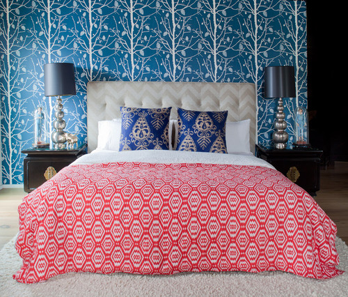
7. Mix patterns and textures to create visual excitement
8. Break up furniture sets
Furniture sets were conceived for the person who wants a ready made room without the fuss of looking for separate pieces. With that ease comes predictability. If you are interested in variety and energy in a space, take away one or more of your set pieces and introduce something new. In the room above, only the chairs match, but it all works very well together.
9. Go for contrast and drama
10. Play with scale to create a statement
Playing with larger scale pieces works best in more minimal spaces where the size and form of objects are highlighted without the distraction of a lot of objects.
If you're choosing a large painting for a space make sure you have some bridging heights like the plant above to connect all the objects in the space. The range of patterns and number of pillows below the artwork also ads visual weight to balance out the large work. Manipulating scale can be a tricky business.


No comments:
Post a Comment