Search This Blog

Tuesday, May 22, 2012

Taming open shelves

 Are your selves like mine?  They start out beautifully arranged and over time bits and pieces of things end up store there, and soon you have a  messy jumble.  If you are someone who can relax in a space no matter what is going on in it, perhaps a jumble of objects  doesn't bother you.  I'm not like that.  If my environment is in a mess that is how my head feels. 

Here are 5 great tips to  bring order to unruly  shelves.


Vary sizes of objects 


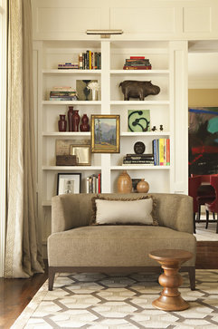
One of the simplest rules when arranging vignettes is to have a range of object sizes for variety.  Some should be small , some medium and at least one piece that is large. And remember to layer to create interest.  Put a tray at the back and then stack  books and a small object on top of them. If you layer artwork make sure it is actually visible.  There's nothing more annoying than using art work in a display and then covering it up.

Use repetition

Hillgrove Project traditional living room

Bookcase Accessorizing eclectic living room 

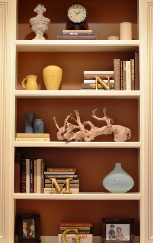
Repetition, when used well, creates a strong design. Choose several elements to repeat throughout the bookcase/shelving. If you have one stack of books laid horizontally, repeat this arrangement in at least two other places.  Use small sculptures, boxes or vases and rest them on top of a pile of books or magazines.

Keep it neutral 

 shelf-style-overall.jpg

When you have a range of objects to store,  one of the best ways to keep things looking pulled together is to choose neutral colour schemes.  I love white objects for this purpose. You might also consider silver, brass, wood etc.   There's a lot going on in the space above, but because everything is white or very pale, a cohesive look is achieved.


 This neutral scheme allows the homeowner to display stored items in an interesting way.  Also notice that the organization on each shelf is organized in two sets with both having equal visual weight.


This is as neutral as you can get in both theme and colour scheme.I love the repetition of bottles and books with variety achieved through shape.

Keep interesting elements at eye level


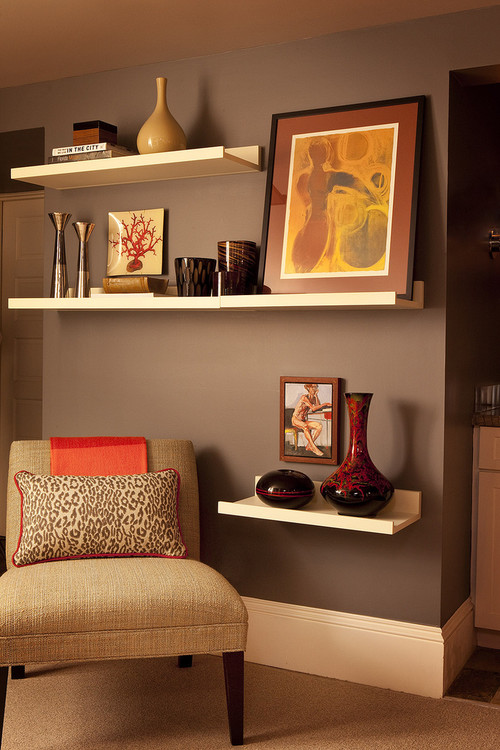
This is an easy one and it really makes a difference. When you walk into a room , you tend to see what is at eye level first.  Don't forget about "seated" eye level  too.  Keep boring objects toward the bottom.  Also remember that if you have a line of books or really dark objects they will have a lot of visual weight and should rest at the bottom of the display.

Create relationships

 Living eclectic living room
 
Choose a common element when you arrange shelving.  It could be similar colours, shapes or content/theme. Choose objects that relate to one another in colour and/or shape to create unity. Vary the size of objects and make sure they relate to each other in some way. In the images above the common theme is containers interspersed with art work.

Wednesday, May 16, 2012

Timeless design

San Fransisco based designer Jiun Ho creates rooms that are harmonious and balanced by using textures against clean lines, simple fabrics and inviting shapes. I am attracted to his interior spaces because they re so well thought out and the scale of everything always seems right. Symmetry and restraint play a prominent role in all his work.  If I had to describe his interiors I would say they are tranquil,  classic and timeless, three characteristics that make beautiful interiors.   He describes his work as   " ... all about style rather than fashion, all about relaxed living rather than studied formality." 
 
 The quite simplicity of this entrance is perfect.  Some might consider it too stark, but I always find clean lines and minimalism  invite one to relax.

This small kitchen space uses an island to increase storage and provide an eating area. Although the cabinets are a darker colour, the lighter walls, floor and  seats balance the darks nicely. 

There is an overall lack of "objects" here,  but those that are chosen have perfect scale for the room.


In his palettes  you usually find one colour as an accent  used with darker neutrals - in this case  brown red . In the rooms below it's a rich gold.


 These two rooms share the fireplace and you can peek through from one to the other.  Perfection. Again darks are broken up with a significant amount of light and the lighting is provided by clean lined fixtures with bold scale.


How do you feel about these rooms?   Do you have a favourite?

Wednesday, May 2, 2012

10 Tips for decorating a small living room

It's a fact that  in many of today's new home builds, either your living room or family room will be a smaller  room.  There are many things that can be done to help visually enlarge smaller spaces. There are ways to use darker colours and larger scale furniture in smaller spaces, but their successful use takes a trained eye.  If you want to decorate a small room  with confidence the following ideas are easily applied. 

1.  Choose light  furniture with simple lines

light furniture small living room
Houzz
There's only one thing I would change in this room. With everything else  so light , I find the darker wood of the table somewhat harsh.  Something lighter would be more cohesive

light furniture small living room decorating advice

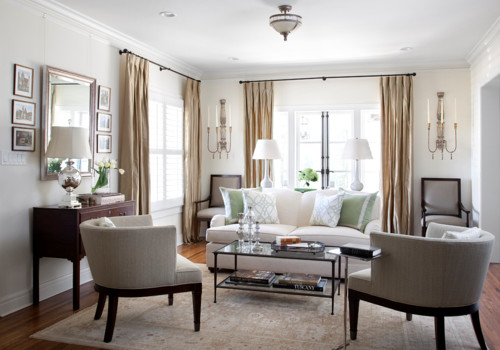
Choose furniture first and look for pieces that are light in colour and have legs. Lighter colours occupy less visual weight and legs provide an unobstructed view of the floor, allowing the space to appear more open.  Coffee and end tables in metal and glass also allow the eye to move through the pieces consuming little visual space while dark wood furniture has the opposite effect.  The cow hide ottoman above works because it is overall light and has great legs. It also serves to connect the tones of the wood pieces in the room.

2.  Choose a lighter colour scheme 

light furniture small living room decorating advice
 Maria Killam

 Neutral colours mixed with  lighter shades of blue and  green  work well in a small living area.  Cooler colours recede  thus giving the impression of a larger space. . Use hints of  brighter colors in  accent rugs or pillows. The golden accents above warm up this space.  Small spaces work best with a three-color (or less) palette as in the room above.  If you love texture consider using a monochromatic scheme.   Bare  wood floors in lighter wood tones also add to a clean, flowing feeling.  Dark floors have the opposite effect.  Unfortunately the current trend for darker floors often causes many problems including closing in a space. The dark mirrors at the end of this space enlarge it.  Which leads me to ...

3.  Use mirrors effectively

mirrors small living room decorating advice
Mirrors can make a small space look larger but it's not that simple.  They function best by reflecting light. That can be the light colour of the wall or refleced  light. Be aware of what gets reflected in your mirror by standing in different positions in the room.  I have seen mirrors actually decrease visual space because they reflect the wrong things.

4.  Emphasize  vertical lines  

verticals in small spaces decorating advice

verticals in decorating a small space

We often forget that a room has a vertical axis. Add things to the space to encourage your eyes to move upward from the furniture.  Floor lamps, large vases with tall twigs, full length draperies, long  mirrors, vertical paintings or stacked paintings, mantles, tables with multi- layered  arrangements etc. are possible choices.Did you notice the large mirror on the end wall?


5. Match the furniture to the scale of the  room  

small scale light furniture decorating a small living room tips

If your room is small, choose smaller scale furniture.  Armless chairs, apartment size sofas, small sectional etc. will make the room appear  more spacious. Consider a bench rather than a conventional coffee table or a glass or lucite table as in #4 photo.  Don't get carried away with this and  end up with  clutter by using too many small items.

6.  Choose multifunctional furniture  

 small Living Room decorating tips

 One of the best ways to deal with limited space is to choose  dual-purpose furniture, e.g., a pair of ottomans can double as coffee tables, with storage inside; coffee tables with a lower shelf can hold baskets, books, covered boxes for storage; consoles with doors make tidy hiding places, bookshelves used as a sofa table when you can't walk around the sofa, etc.   

7.  Build in storage 


Give a small space  character and maximum function with a bank of custom-built cabinets in a light colour.  Built in cabinets and shelving triple storage options.  Keeping the colour of built ins light will increase the visual space. Arrange objects on open shelves in an artful way.  Leave lots of open space and vary the sizes and shapes of decorative objects. 

8. Harmonize  large pieces of furniture

harmonized furniture small space decorating

If you have a  sofa or sectional that you need to keep and it dominates the room,  paint the walls  a shade that is just a bit lighter than the upholstery . The eye will move  across the room rather than sticking on  the sofa. In the room above a stone wall harmonizes with the sofa and the warm yellow from the wall is picked up as accents.

9.  Control clutter

clutter control small spaces

Find interesting ways to store the objects that are needed in a room, e.g.,  storage cubes, baskets, covered decorative boxes, ottomans, etc. This room has a lovely wicker basket which serves as an end table.  On the shelf  is a fabric covered box and the coffee table has a lower shelf which can be used to store books, boxes, baskets etc.Sometimes the more space you have the more objects you accumulate. Keep shelving organized.

10. Layer lighting

layer lighting small spaces

Lighting is important in any room but even more so in a small room.  Keep window  treatments light and airy so that the natural light can shine through or have drapes that can be pulled back to let the light flood in. . For evenings or when there is minimal natural light use additional lighting to maximize each area of the room. A dark corner is a great place for a floor lamp or an accent table with a lamp for reading.   Wall sconces take up little space and can be used to highlight a certain areas of a room. Lights over artwork add an additional layer of brightness and highlight the artwork.  I try to have at least four  levels of light in a room- natural light, dimable ceiling lights, floor lamp or sconces, and  table lamps. Do a visual check to see if the four corners of your room have adequate light.

Many of these ideas will work in much larger rooms too.  The most important thing to remember is to select furniture that is the right scale for the space you are decorating.